A university project created in collaboration with Jakub Krehel and Monica Lefèbre.
The work consist of corporate identity design and way finding system. I was responsible for developing the logotype, the custom typeface and poster design, which are all shown here. More of the project can be found ✨ here ✨
Our team’s main inspiration was the state of the park after it has been abandoned for many years. Nature has taken over and plants are growing everywhere covering the disintegrating rides and buildings. The combination of the overflowing greenery and the remaining buildings and pathways is best described as “controlled chaos”. This term was at the core of the design process from start to finish.
Logotype
Out of home advertising mockup
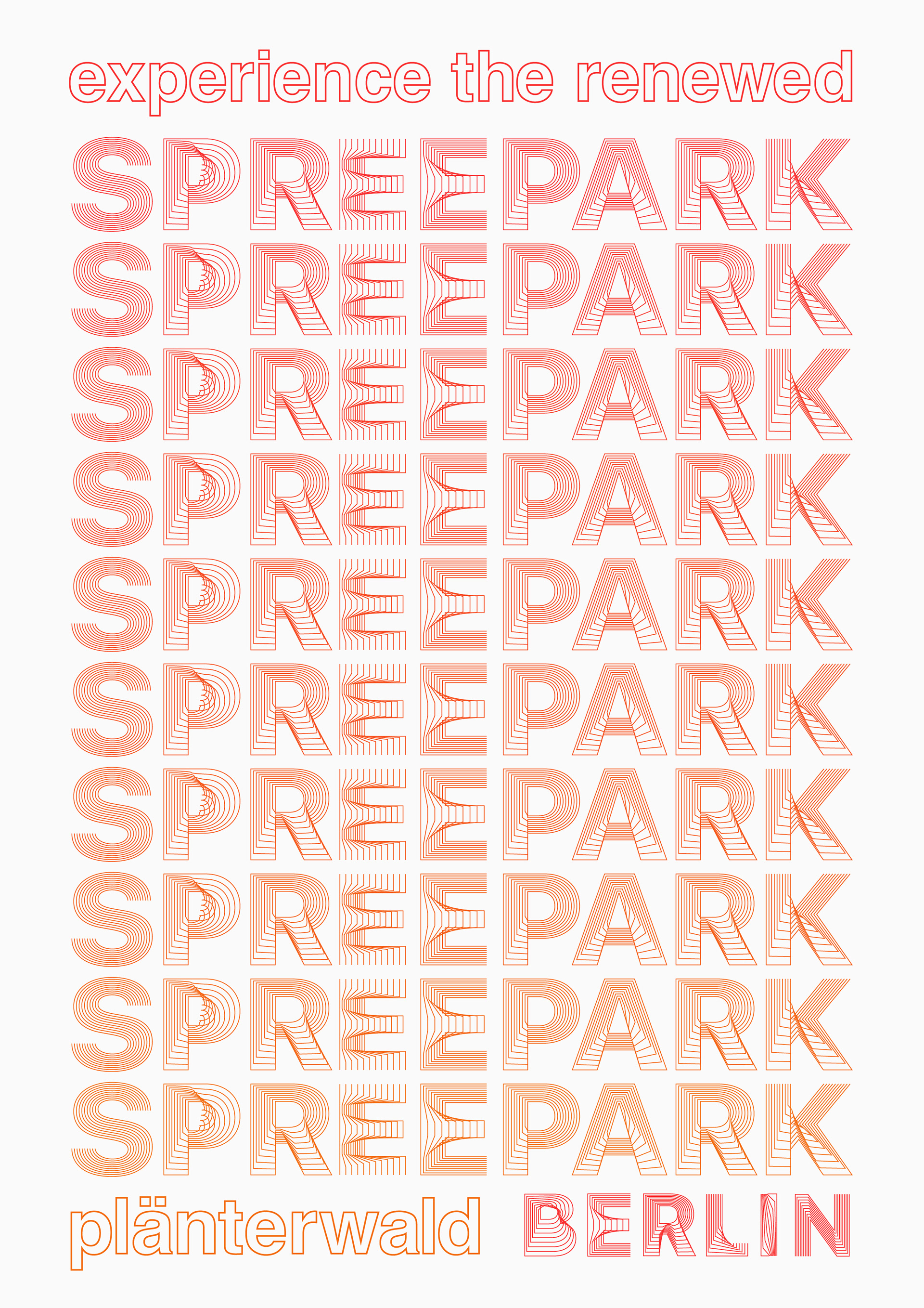
A typographic poster with a red and orange colorpalette, caption experience the renewed spreepark, plänterwald berlin
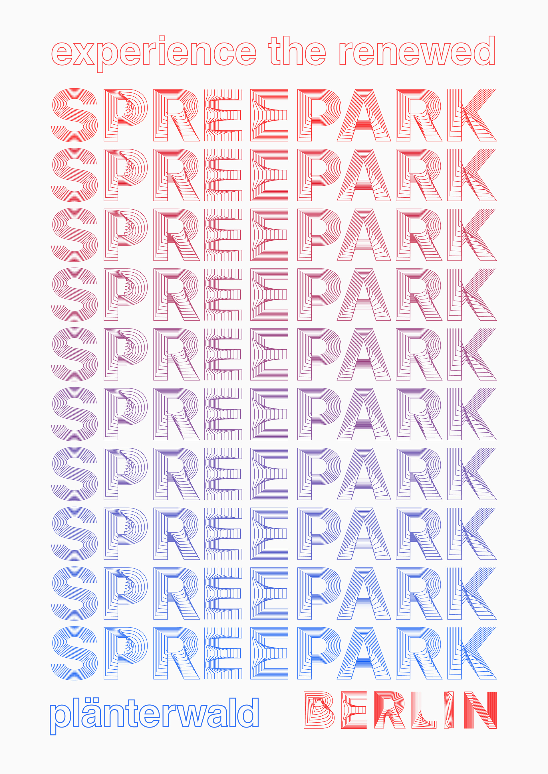
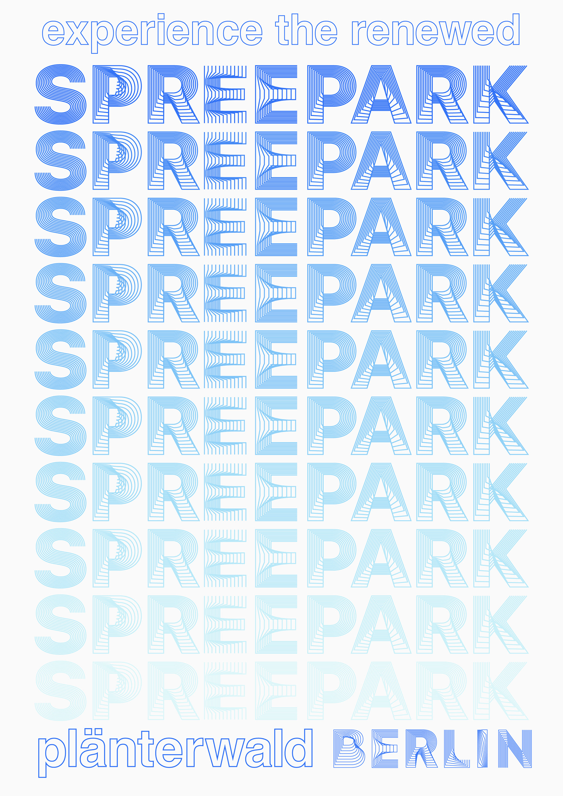
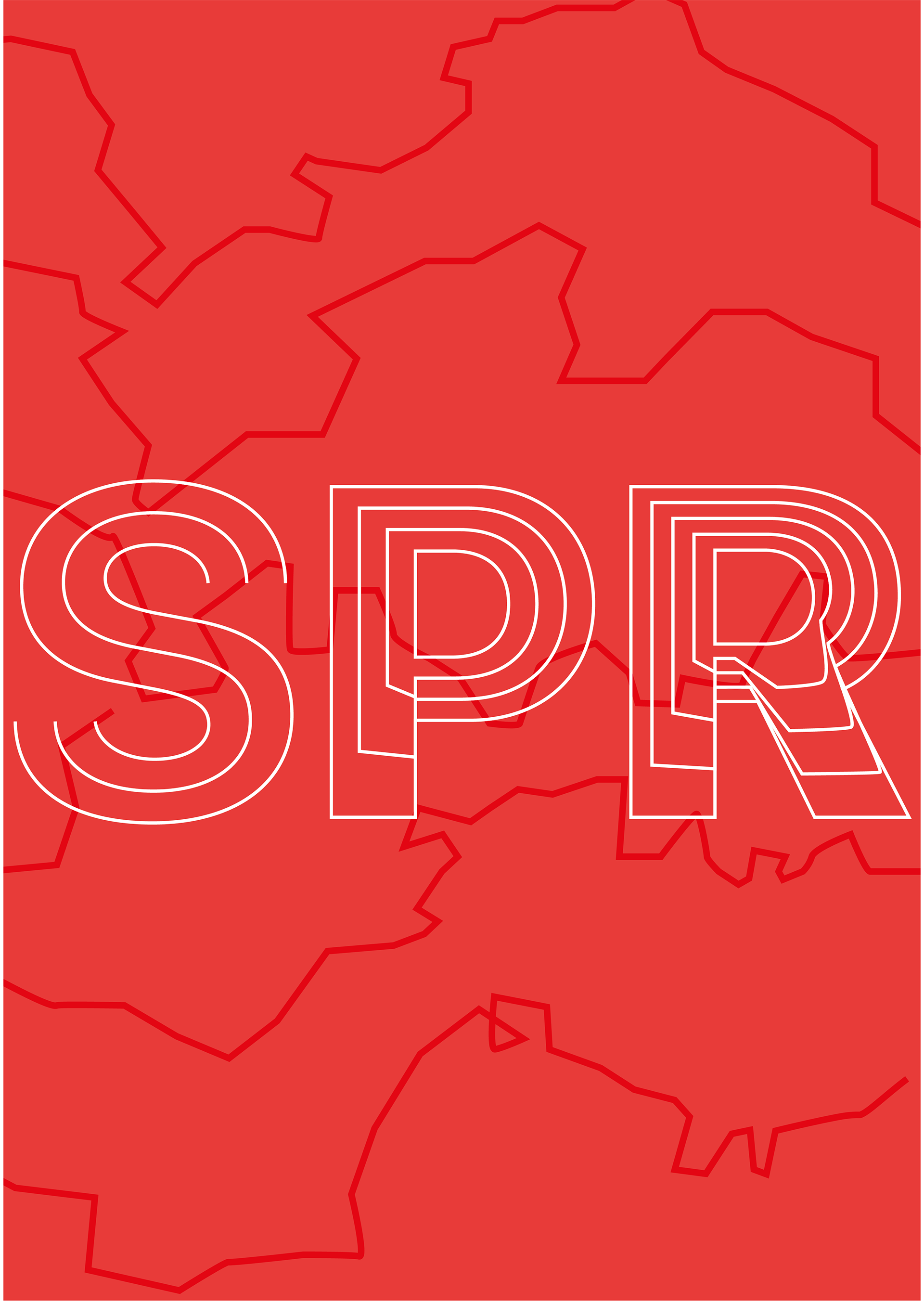
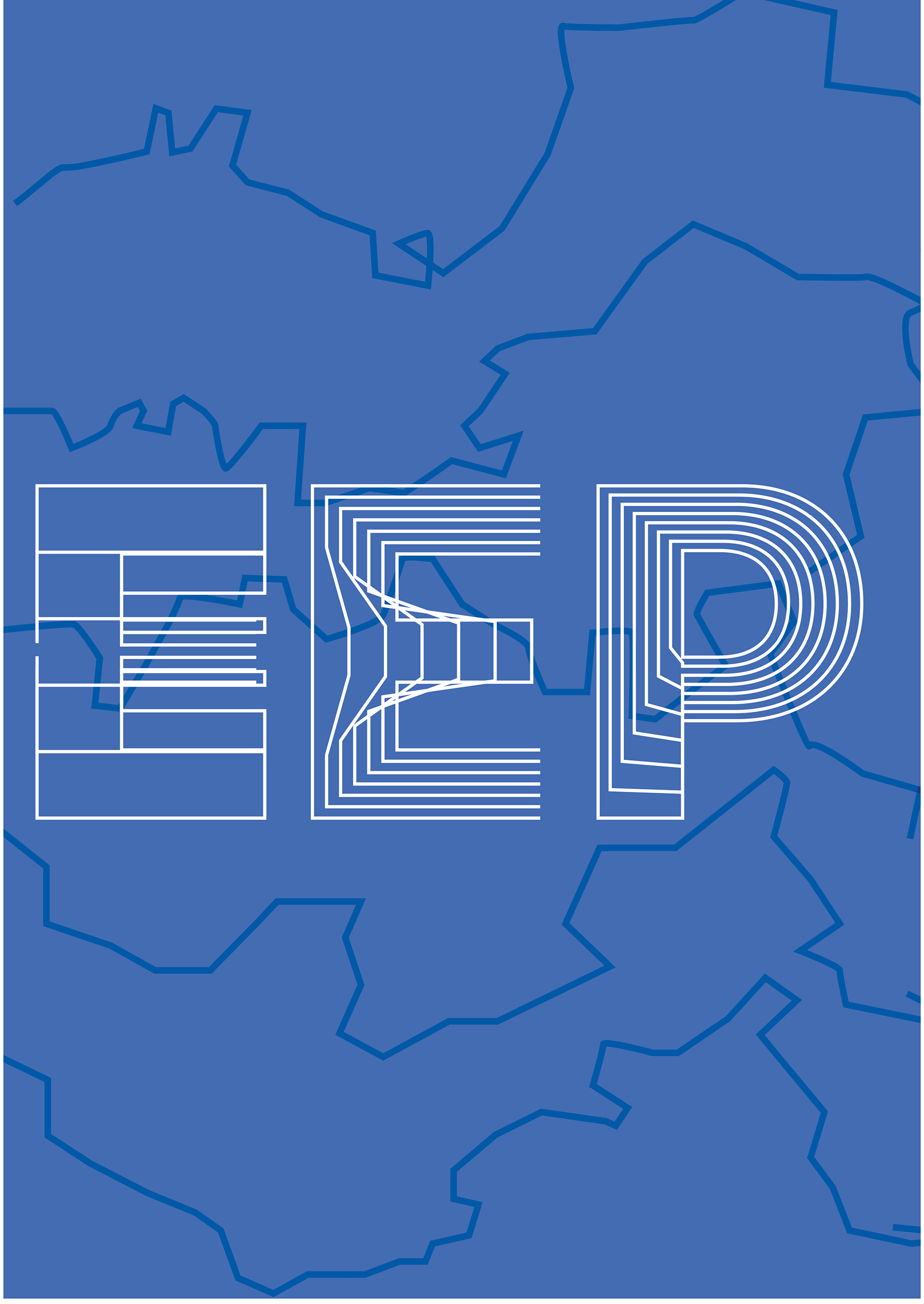
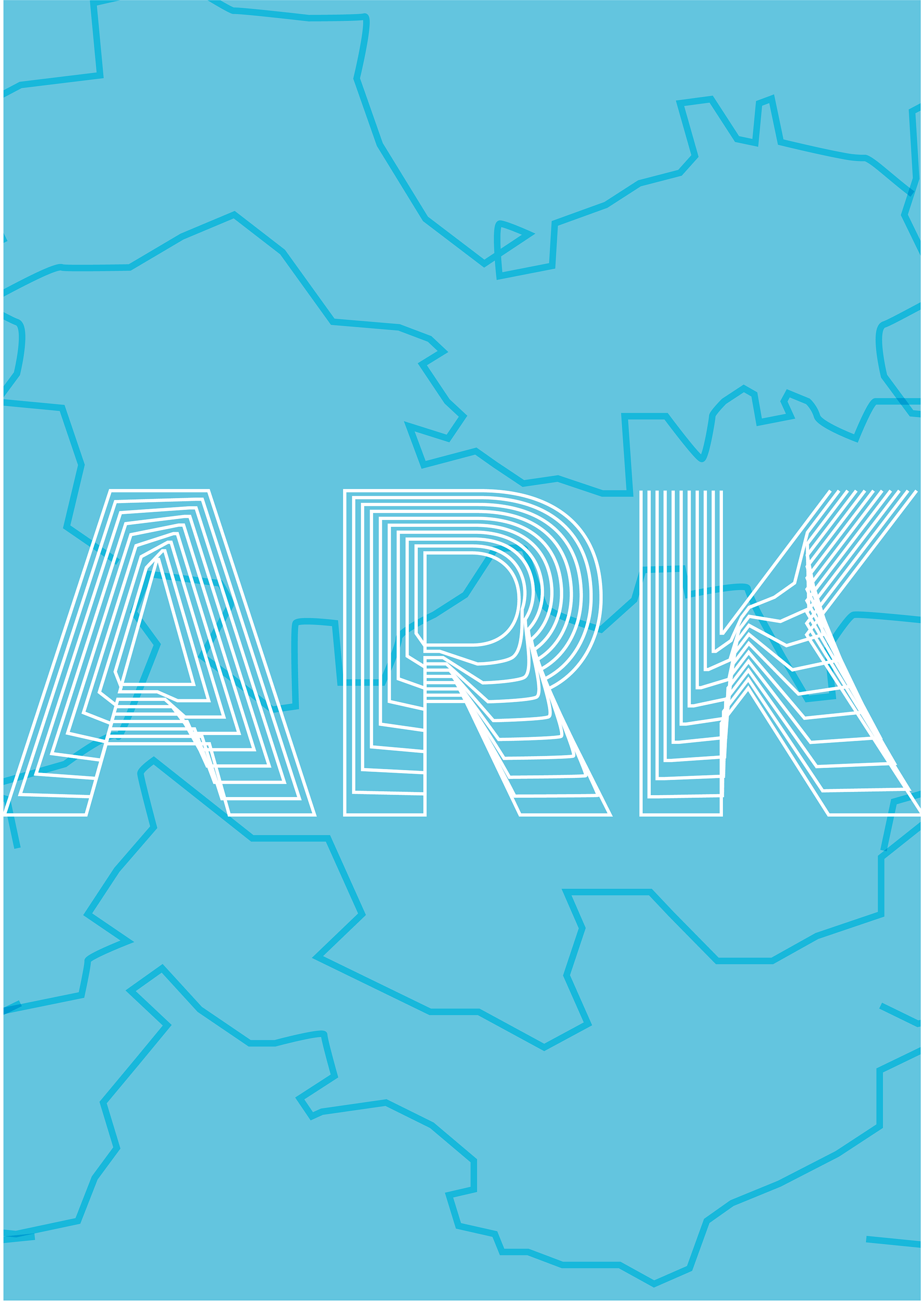
Examples of how the type can be used in marketing material on various platforms.
