Mobile app concept, UX/UI design
Aurora observer is a mobile application that is based on local, real-time sightings of the northern lights. Users can make reports that describe the current weather, activity of the northern lights, and light pollution. Once posted, these reports show up on a map for other users to see.
I had the idea for this project when I lived in the Finnish Lapland in winter 2021 and tried to interpret space weather forecasts on various websites and apps. Although many sites provide real-time data on the visibility of northern lights, I noticed that posts on social media turned out to be the more reliable source for this information. Seeing posts from nearby helped me assess how likely it was to see the aurora borealis from my own location.
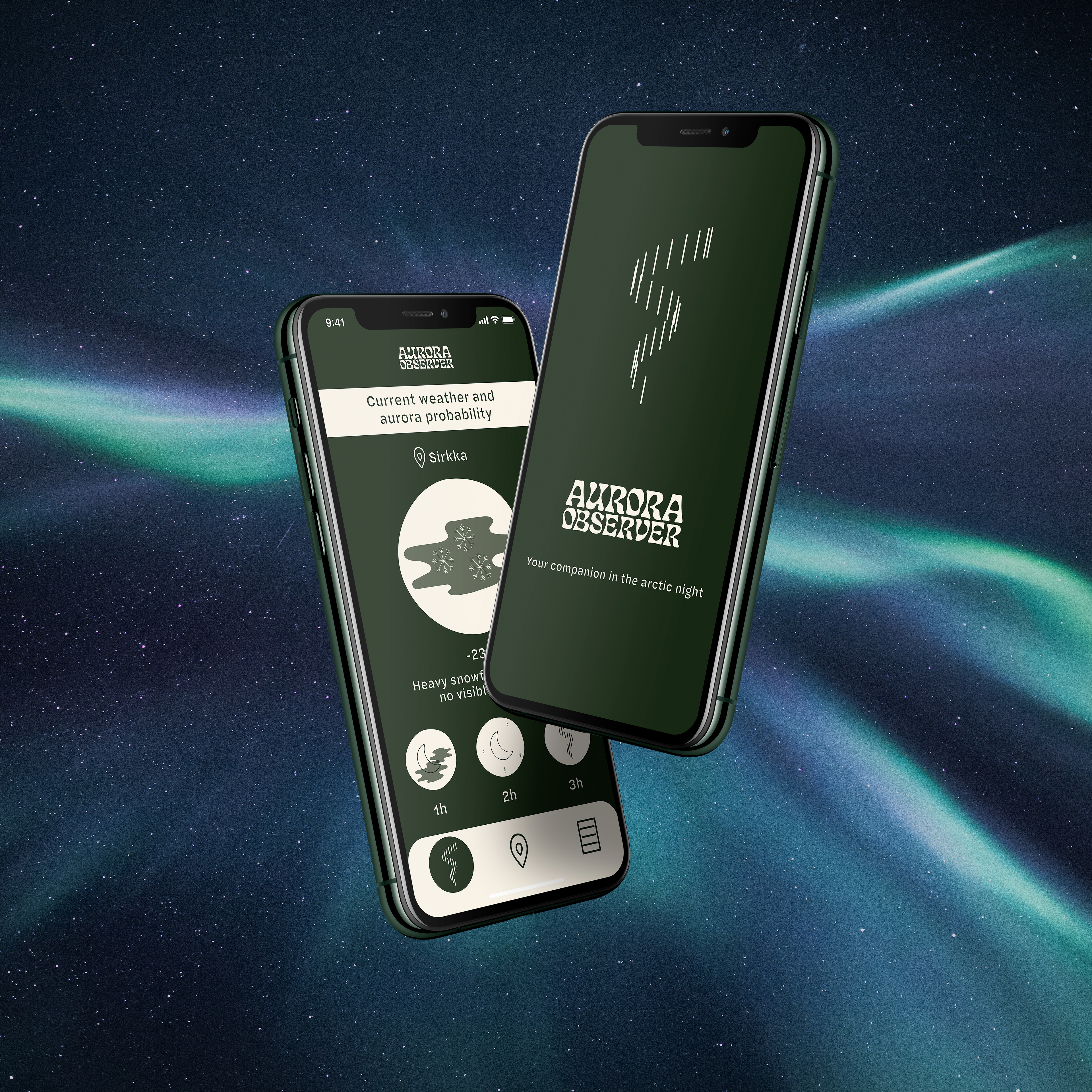
Mockup background photo by Maria Vojtovicova on Unsplash
Weather and auroras
From the home screen, you can check the current weather and northern lights situation, as well as forecasts for the next three hours.
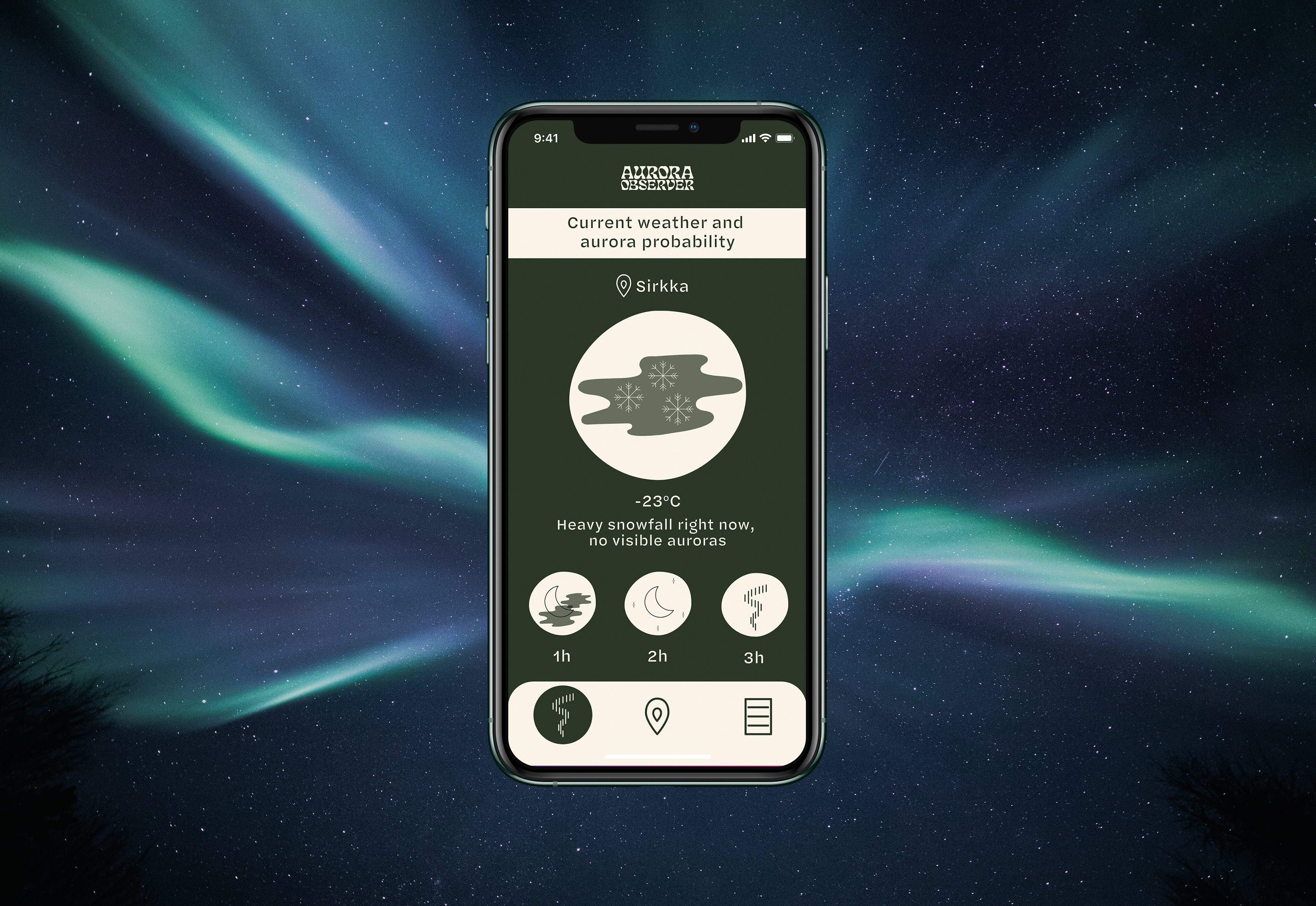
Mockup background photo by Maria Vojtovicova on Unsplash
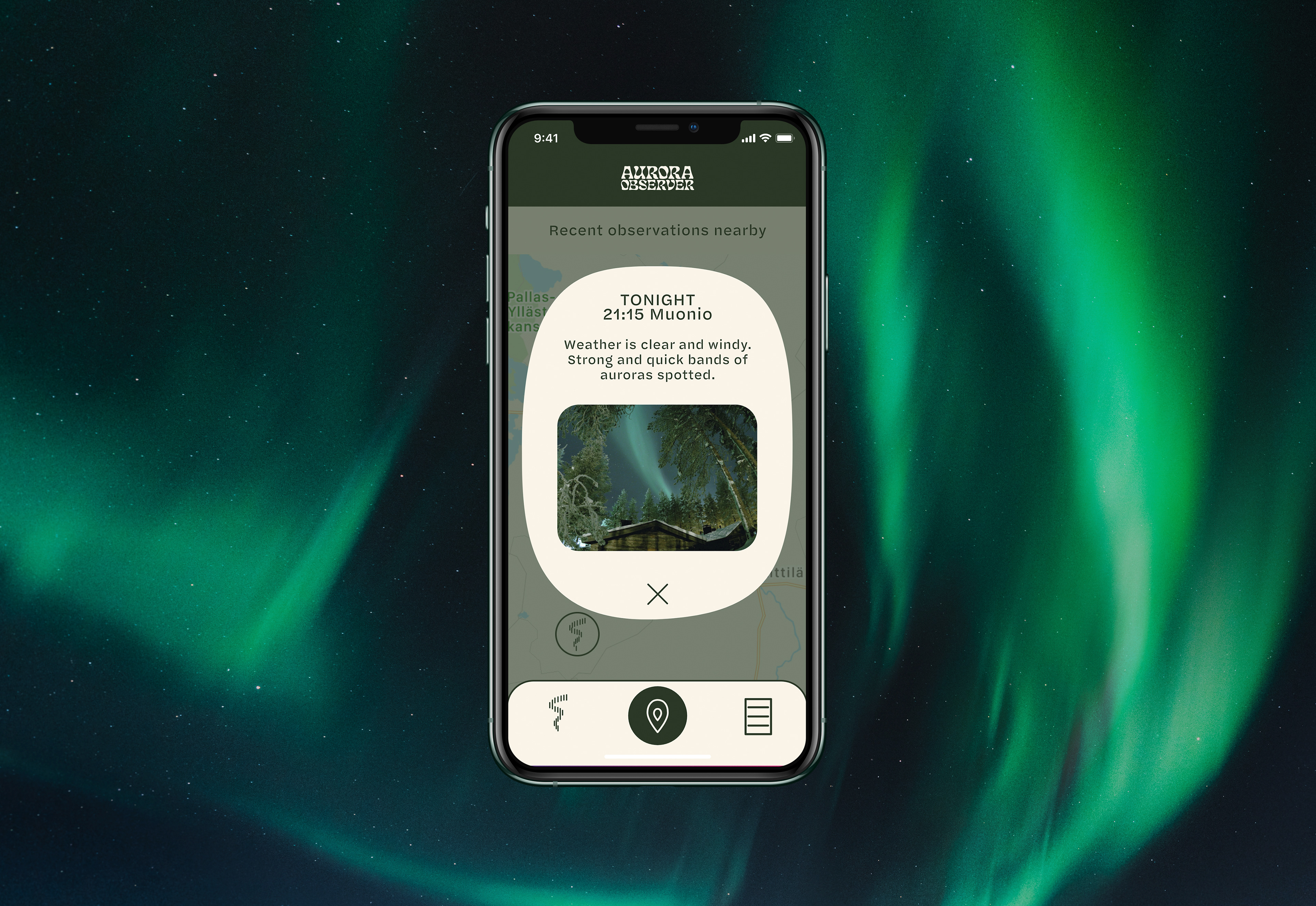
Map
In addition to your own location, the map shows nearby observations.

Report
Filling up the report is easy. All the user has to do is choose the appropriate words to describe the weather and the northern lights. Pictures and notes can be added if wanted.
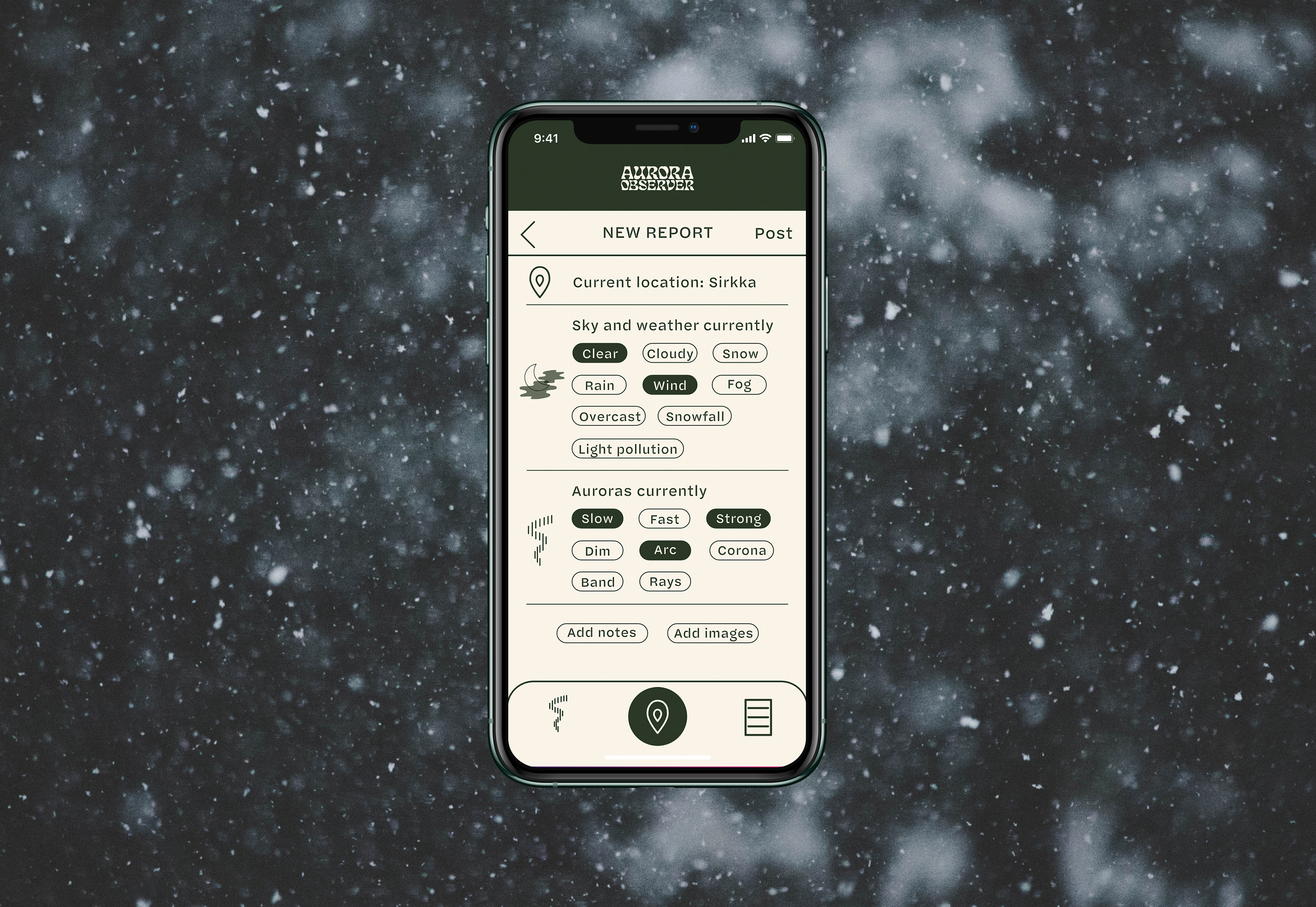
Mockup background photo by Aditya Vyas on Unsplash
Sightings
The app generates a short and easy-to-read text of the report.
Mockup background photo by Federico Di Dio photography on Unsplash
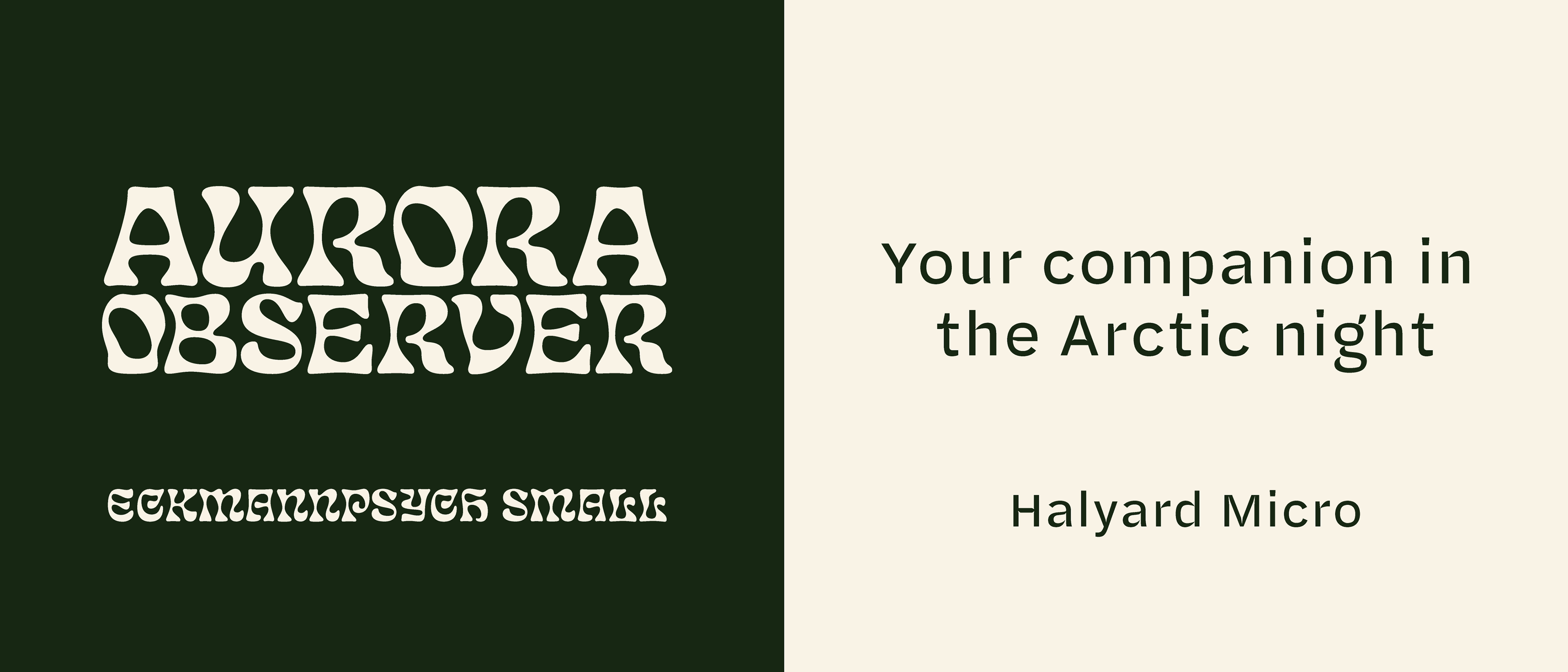
Branding and visual design
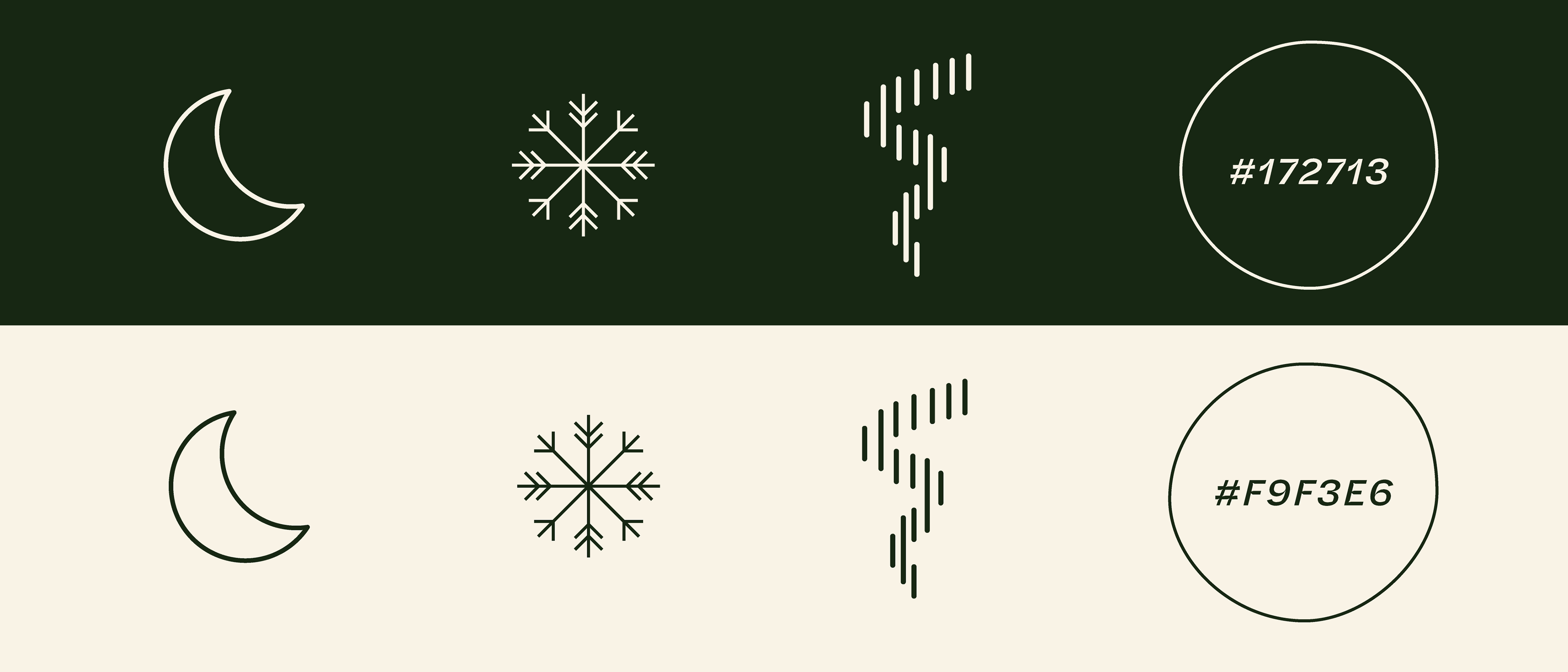
The typeface used in the logo is "Eckmannpsych" by Oh no Type. The decorative display font is paired with a sans serif, "Halyard" by Darden Studio.
The icons consist of simple, individual parts that can be used to make a variety of small, easy to read infographics.
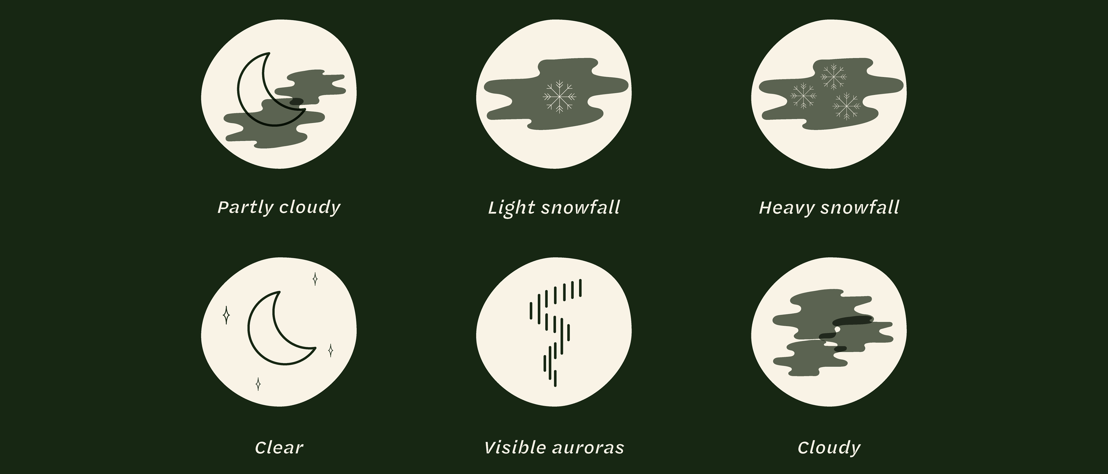
The two colors used are a dark, forest green and an off white. I chose these two because they are natural and contrast each other well.